On Typography: A Crash Course on Type Anatomy
- Mar 27, 2018
- 3 min read
Clueless when your cool designer friends allow you to hang with them as they communicate in their jargon? Do you find yourself nodding along nervously, feeling your palms sweat as you attempt to decode their typography slang? With our guide, you’ll get the lowdown on the type anatomy and be able to differentiate a counter from a bowl for example – and nope, we don’t mean the kind you’d find in a kitchen. 😉
Type Anatomy And Its Terms
The first thing you need to know about type anatomy is the difference in terms between uppercase and lowercase letters. In the two images below, you can spot the differences and read a small caption about each of them.
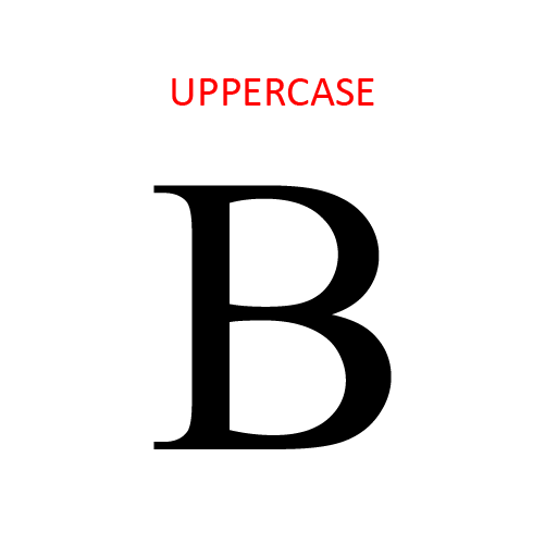
The uppercase is a letter that’s generally used to begin sentences. It’s also known as capital letters or majuscule.
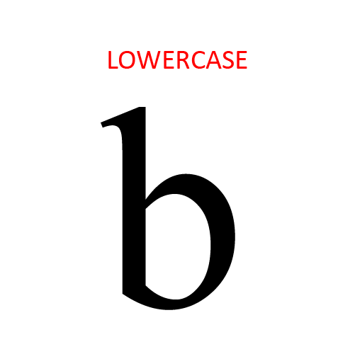
The lowercase is the smaller form of letters in the typefaces. It’s also known as minuscule letters.

Before we dive into the specific terms of type anatomy, we’re going to show you how the letters can remain consistent through a word or phrase because of the use of some guidelines that are invisible to the eyes.
The baseline is the invisible line where the letters sit. The x-height is the height of the lowercase letters that are based on the letter x. The cap height is the height of the capital letters. The descender line is the invisible line that marks the end of the descender stroke of some letters. The ascender line is the invisible line that marks the top end of the ascender stroke of some letters. In some typefaces, the ascender line and the cap height are the same. In the example above, they are different. You can see that the ascender line goes above the cap height.
More Type Anatomy Terms

Stem is the primary vertical stroke of a letter.
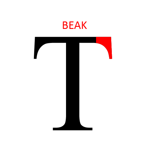
The beak is a stroke that goes at the end of the arm of a letter, as seen in the T above.

The bracket is the curved connection between the stem and the serif of a letter.
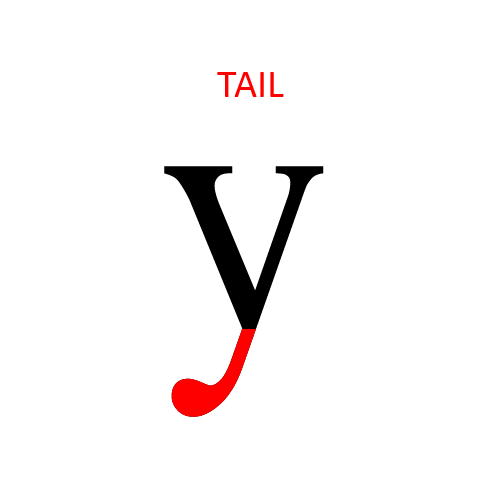
The tail is a descending stroke of a letter. It appears on letters like g, j, p, q, y, R, and Q.
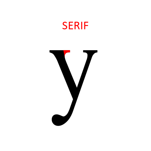
A serif is the stroke added at the end of the main vertical and horizontal strokes of the letters. In this case, it’s also called a bracket serif because it is curved.
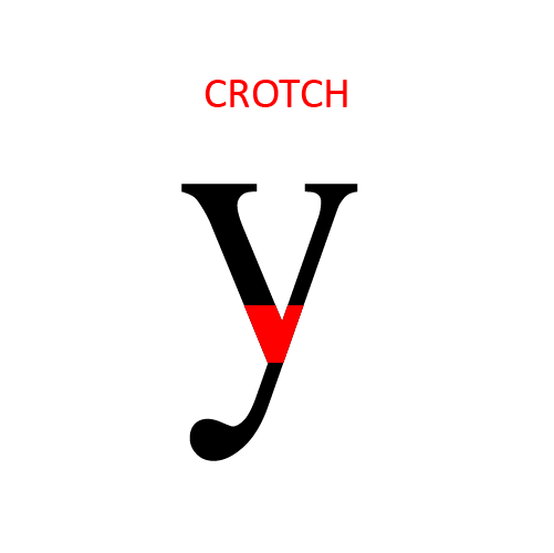
Crotch is the part of the letter where two strokes meet.
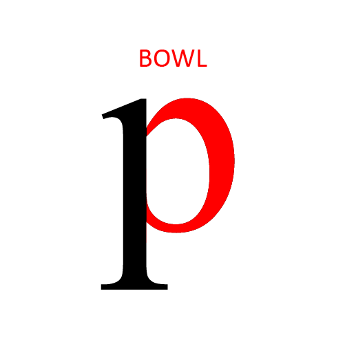
A bowl is a curved part of the letter that encloses the counter (see below). It appears in some letters such as d, b, o, D, and B.
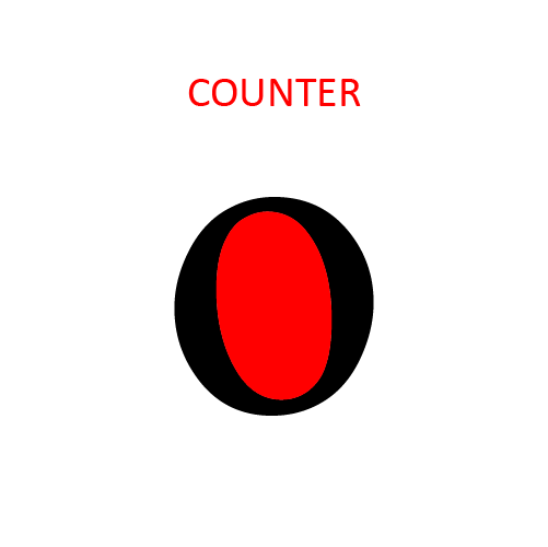
The counter is the negative (or white) space within a letter. It appears in letters such as o, a and d.

The descender is the part of some lowercase letters that extends below the baseline. Letters such as p and q have descenders.
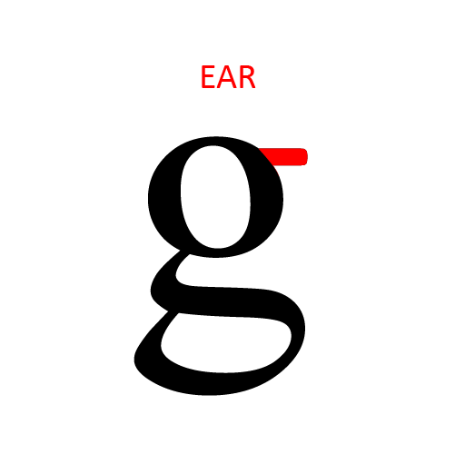
Ear is a small stroke that extends from the upper-right bowl of some lowercase g’s.
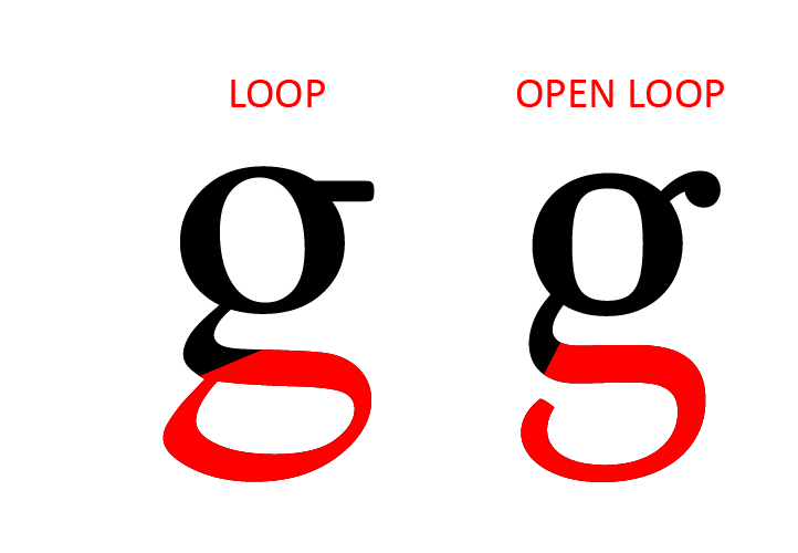
Loop is the enclosed or partially enclosed (also called open loop) counter below the baseline of a g.
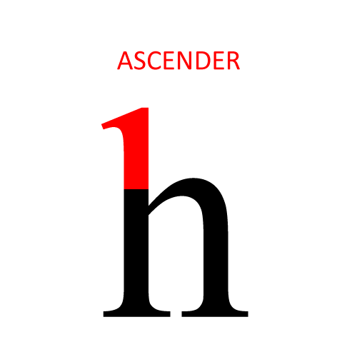
Ascender is the vertical stroke that extends above the x-height.
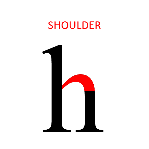
Shoulder is the curved stroke that originates from a steam in letters such as h, n, m.
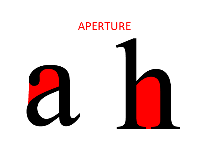
Aperture is the partially enclosed negative (or white) space of some letters.
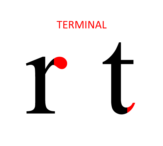
Terminal is the end of a stroke that doesn’t have a serif.
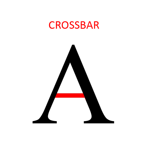
Crossbar is the horizontal stroke seen in letters such as A and H.
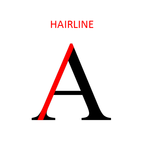
Hairline is the thin stroke of serif typefaces.
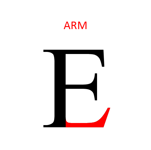
Arm is a horizontal stroke that doesn’t connect to a stroke or stem on one or both ends.

Diagonal stroke is the angled stroke of letters such as Z or X.
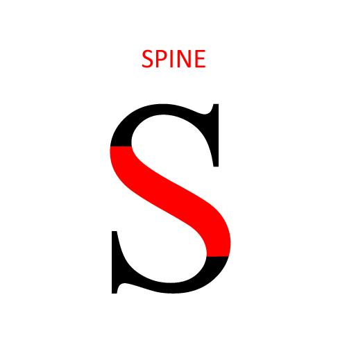
In the letter S for example, the main curved stroke is called the spine.
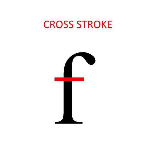
Cross stroke, for instance, is the horizontal strokes that will intersect the stem of a lowercase t or f.
That’s all! Everything you just read in this article covers the basics terms of type anatomy. Hopefully, this will serve as a handy guide to you if you’re in doubt about which terms to use or what a specific term means. You can finally talk about type anatomy without any hesitation!
–


Comments